Grid Project for Foundations of Design II. 1" squares were cut out of magazine strips and arranged in a 15"x17" grid. Students were required to arrange their squares in a manner that either created emphasis or gradation. My content came from a magazine that focused on the '80s band The Smiths, and I used grey values to create gradation and red accents for emphasis.
Abstract Typography Project for Foundations of Design II. Each student was assigned a word of onomatopoeia to create an abstract, typographic design based on the work of Norman Ives. The design was hand-drawn and painted on 10" square.
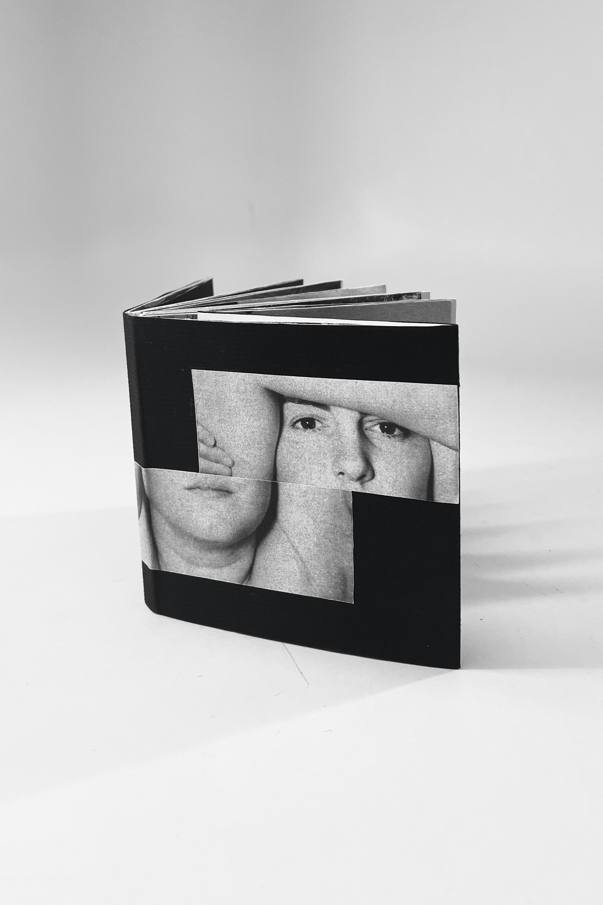
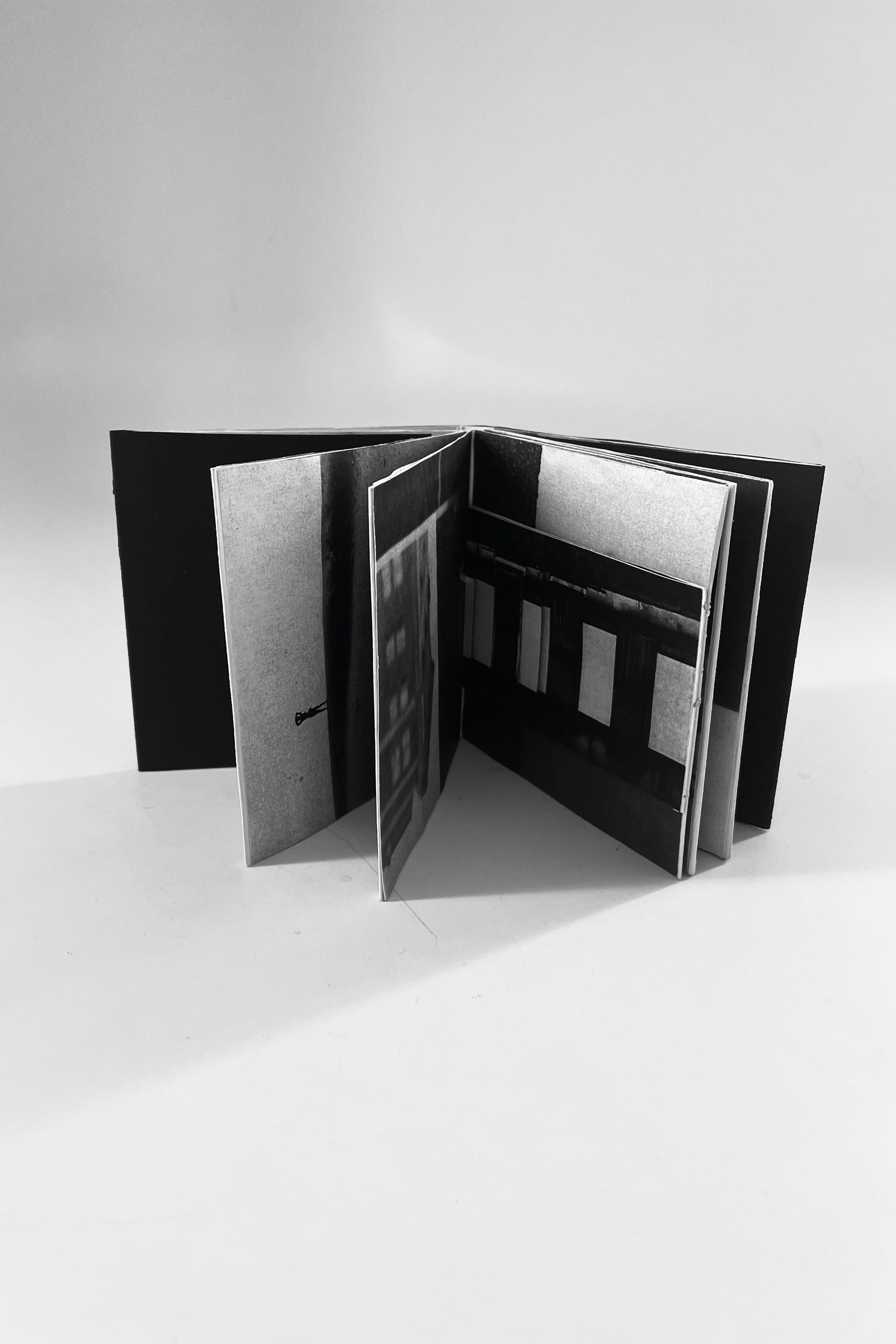
Artist Book for Foundations of Design II. For my final project, I decided to focus on Harry Callahan’s work. He is known for photographing street scenes, landscapes, and his wife Eleanor..
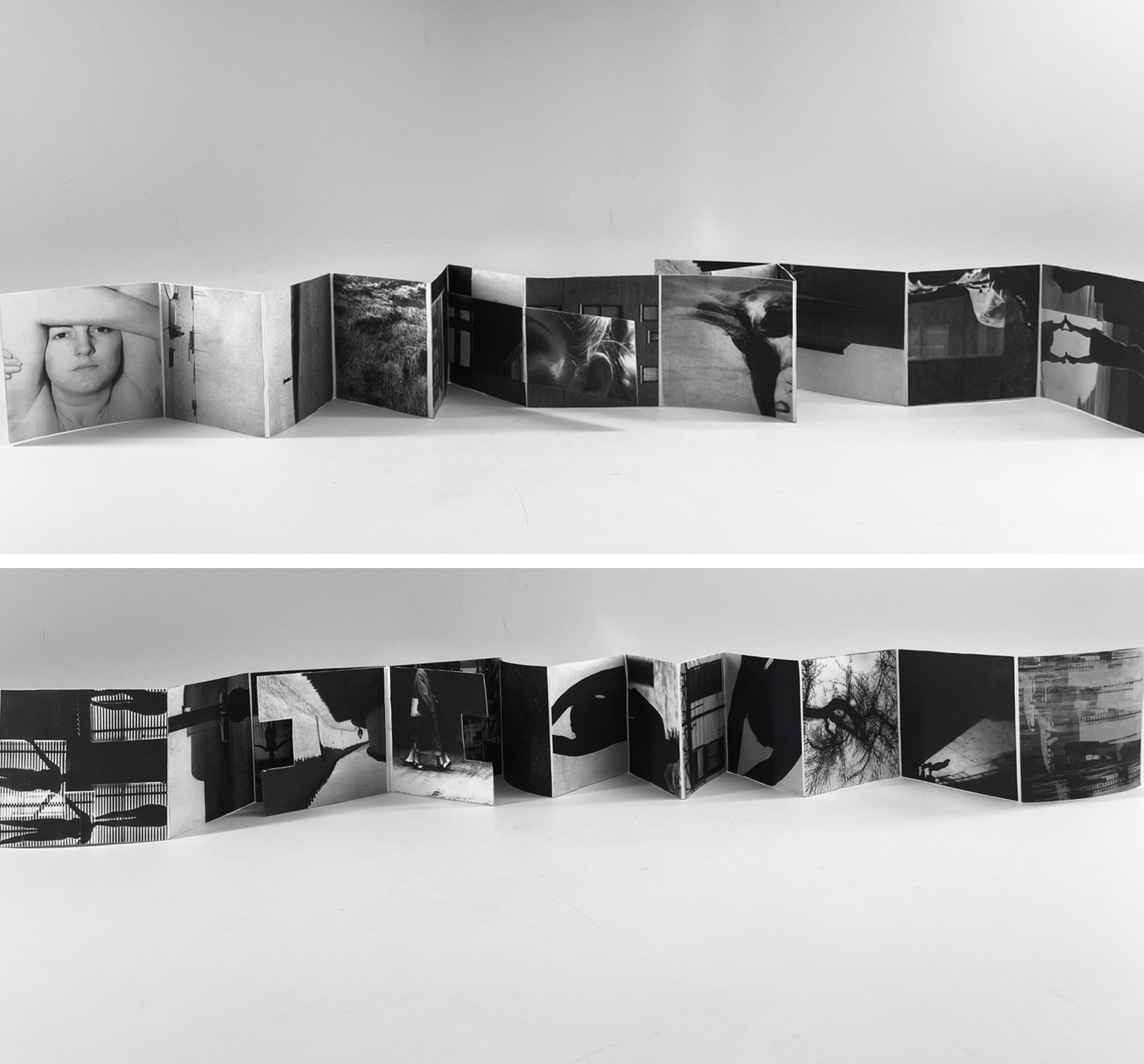
My progression book is based on self-discovery, and I combined all three of Callahan’s main subjects to execute this idea. As the book continues, texture and shape become more evident, representing how one learns through new experiences.
The second side of the book immediately starts with dark values, whereas the first side began with light values. This shows how the journey to self-discovery is not always easy, but the persistence of light values emphasizes how one can overcome adversity.

You may also like

Back to Top